The Edge
Logo Design, Branding, Signage
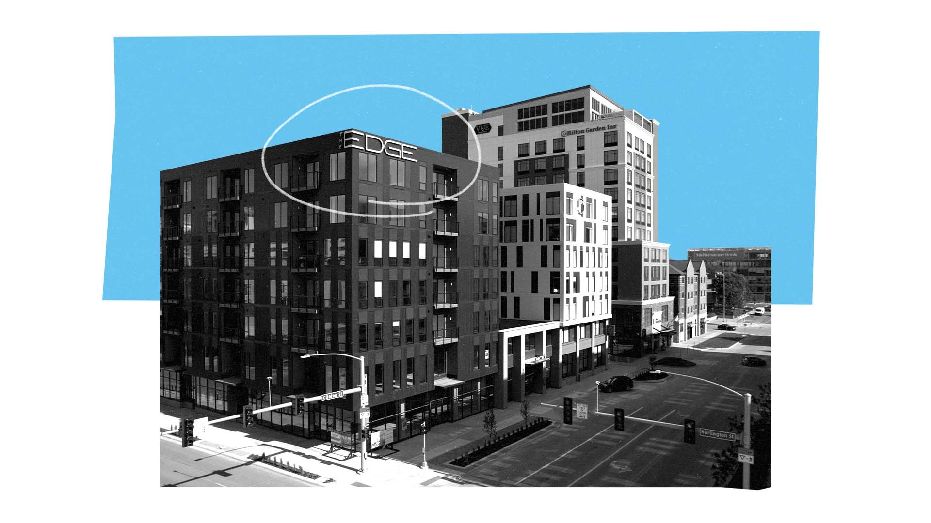
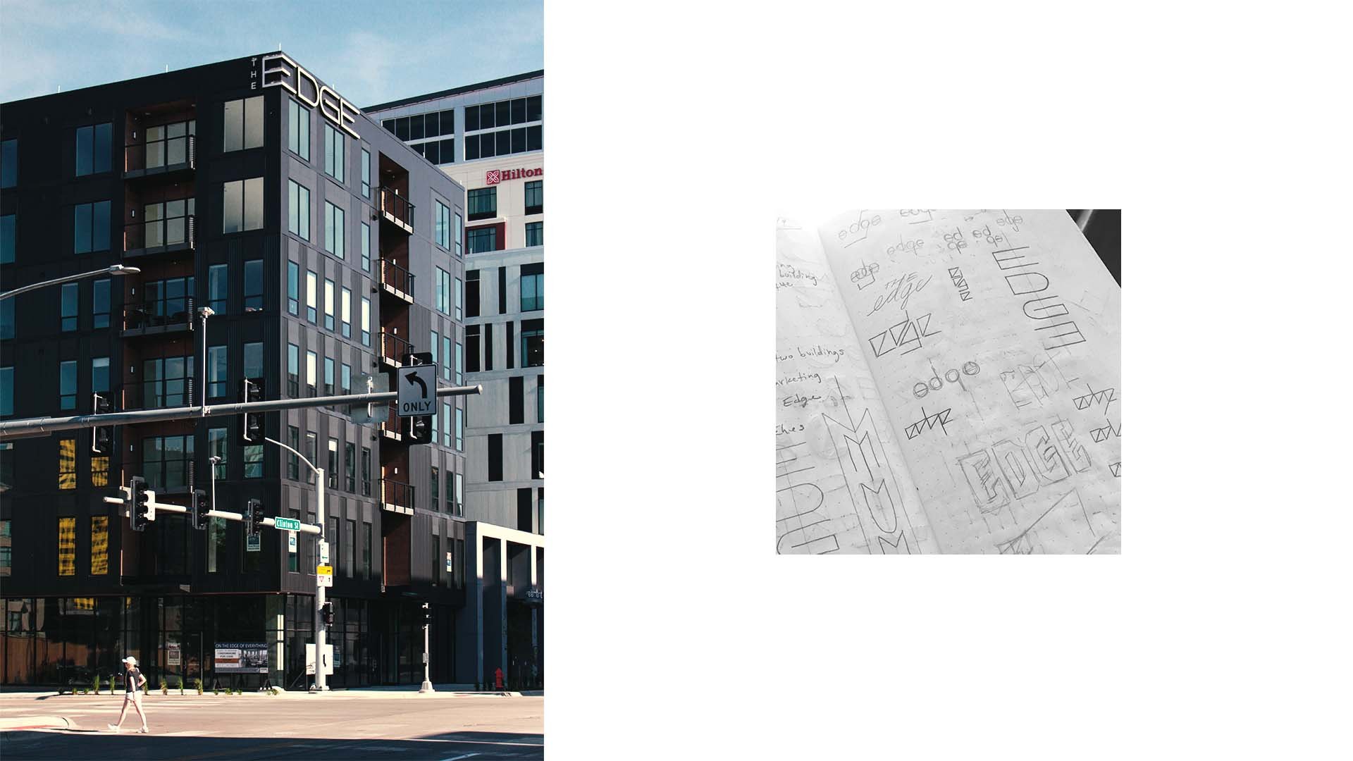
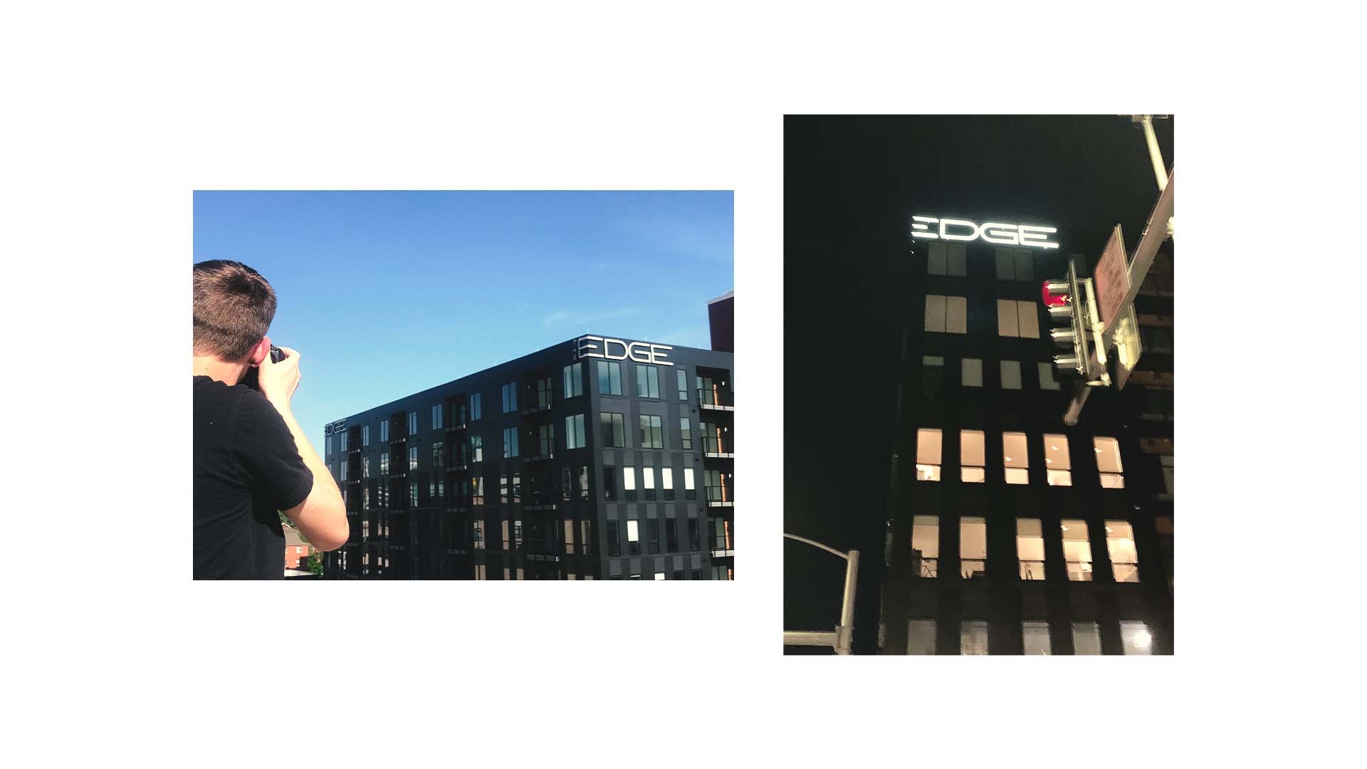
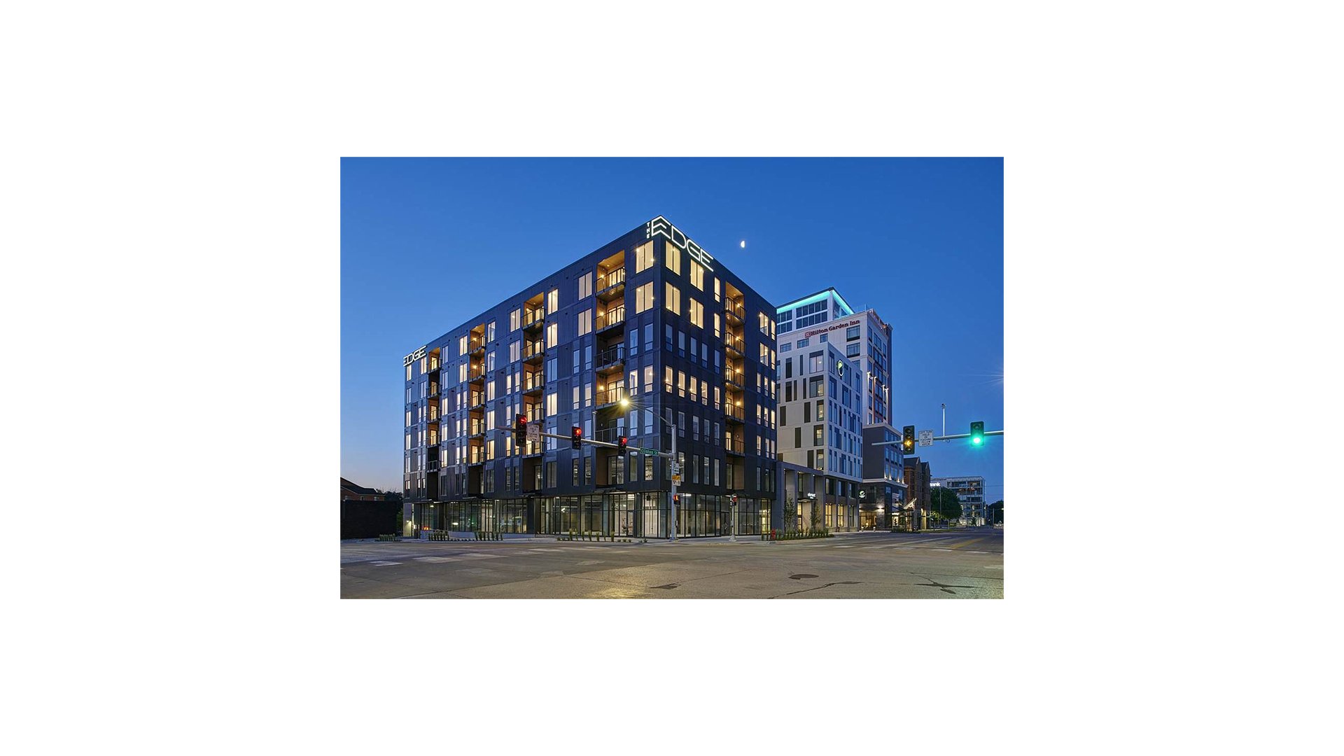
The Edge is an apartment building strategically located at the intersection of the two roads that define the downtown area of Iowa City, Iowa. The sign needed to be legible from the street, sleek and modern, yet approachable for the young professional looking for a place to live.
There is already a building next door called “The Element” with a large “E” logo, eliminating the possibility of centralizing the logo around a strong “E” mark. However, conceptually emphasizing the name (The Edge) by incorporating the edge of the building into the actual structure of the sign created an experience that is three dimensional, non traditional, and memorable.


