Isthmus
Design, Illustration and Animation for the April 2023 issue
Isthmus is an independent, local news source based in Madison, Wisconsin, providing thoughtful coverage on arts, culture, food and politics. Each month a local artist or designer is tasked with creating the cover for the issue. This cover could be focused on a specific holiday, local events, seasonal changes or something else determined by the artist.
I had the honor of creating the April issue as we sprint headlong into spring. I started thinking about things like transformation, transition, new growth, renewal, starting over, opening up, awakening, revival, metamorphosis. You know, classic spring things.
Below is the process of how the cover design and animation came to be.


Like all good things, it started with some scribbles.
This initial brain dump of ideas holds some elements of the final cover. On the right side toward the top you can see the “frames of an animation” idea and on the left side at the bottom there is a composition created by nine squares.
At this point there aren’t any solid ideas yet, just the rumblings of some.
Sometimes when I tell people I’m a designer they say, “Oh I could never do that, I can’t draw.” I always respond with, “Me neither!”
The purpose of sketching is to take what is in my head and transfer it to paper. That’s it. If the concept requires more serious drawing that will come later.
Did you notice there’s literally a stick person in one of these sketches? Stick people are what children draw. But I had the idea, “What if someone was running from winter to summer and all their heavy winter clothing was falling off?” I write WINTER and then I write SUMMER and then I draw a stick figure running in between the two words. As long as I have this sketchbook I will never, ever forget this idea. If you’re interested in learning more about the importance and power of simple visual communication check out Understanding Comics by Scott McCloud.
After more sketching, creating some layout in the computer, these are the four concepts that emerged.


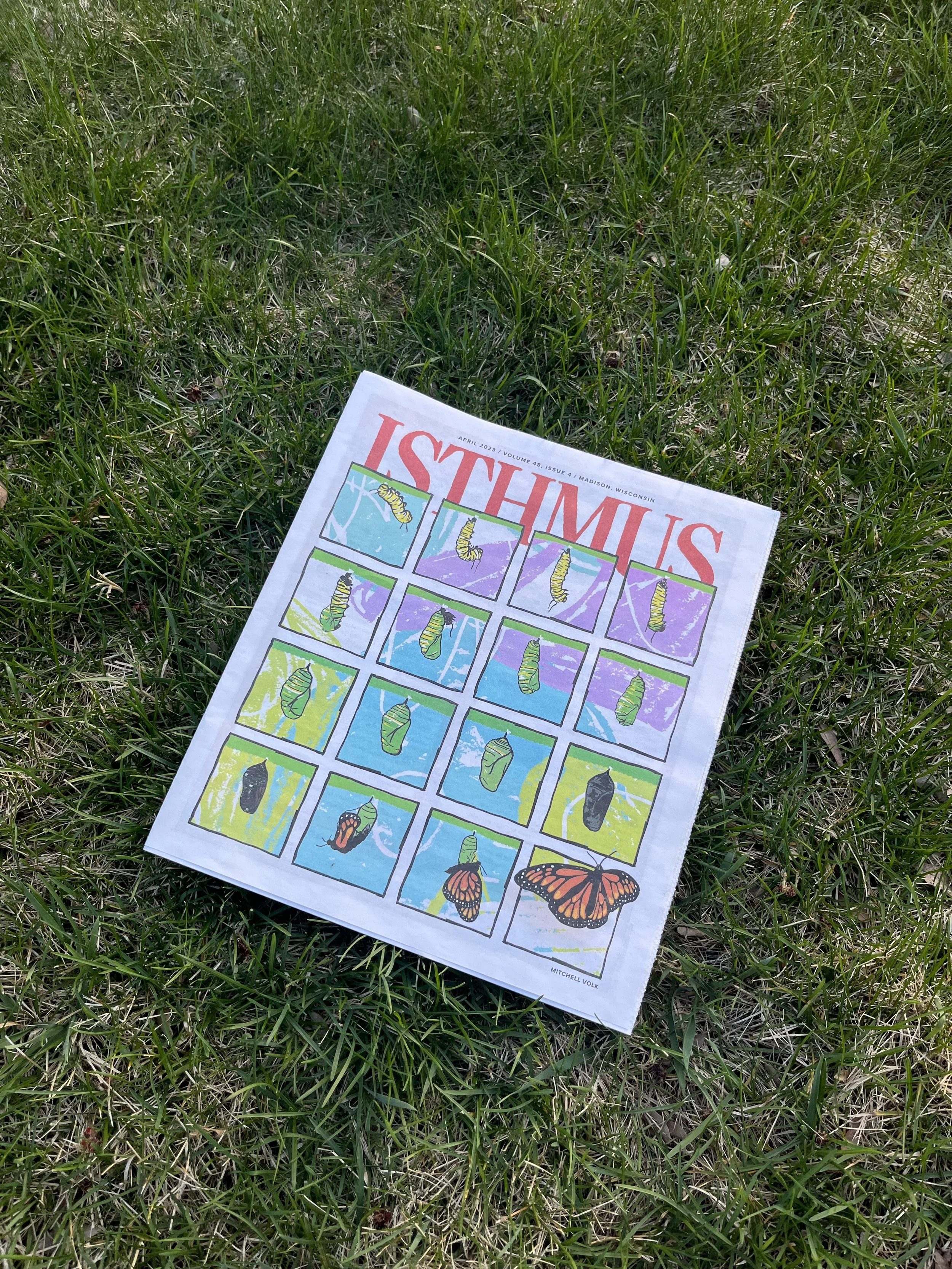
Concept 1 shows the frames of an animation of caterpillar becoming a monarch butterfly. This initial sketch was going to show every single frame, which at the time was 30 frames.
Concept 2 is focused on nature reclaiming technology. I’ve thrown my phone into a ditch as I run into a sun-soaked filled field. I come back in the fall to get my phone again and it has become a part of a dandelion plant.
Concept 3 would be focused on Earth Day. We see the earth surrounded by illustrations of people doing various eco-friendly activities.
Concept 4 was just an idea. I wasn’t sure how to make it an interesting cover by itself, but I thought the idea was strong. It converted your phone into a paperweight so you could be free to go outside and enjoy the day.
Tommy Washbush (Art Director at Isthmus) gave great feedback and pushed the work further. Here’s the next round of sketches.


We pushed Concept 1 in two different directions: one with all the frames and one with fewer. The layout with fewer frames is a stronger composition for print, so that’s the direction we pursued. The other two layouts above are attempts to make Concept 3 and Concept 4 work as well, but in the end Concept 1 (with the animation) was the best.
Tommy said they’ve never done something like this before so to have the opportunity to fulfill the assignment while including some interactivity was super exciting.
Knowing that the layout was basically solidified, I started working on the animation.
Up to this point I was just working with quick sketches and didn’t actually know what the illustration style was going to be so I experimented with a couple different directions.
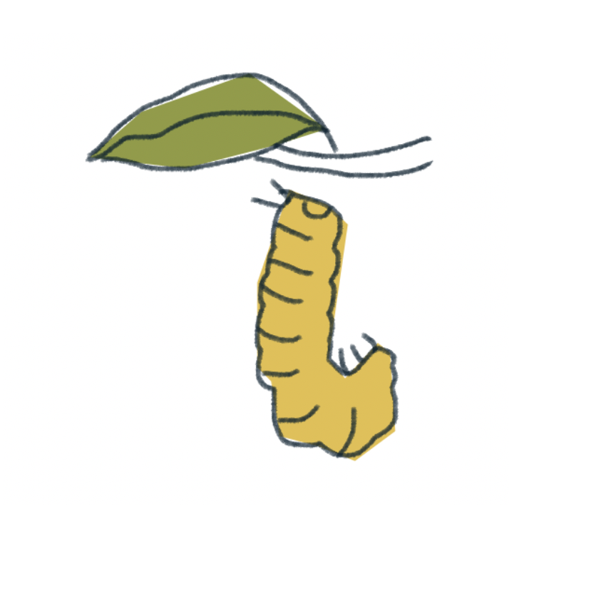

I wanted it to feel expressive and full of life. I felt like the quick and rough style did a better job of communicating that. Plus I had to keep in mind I would have to make about 30 drawings!
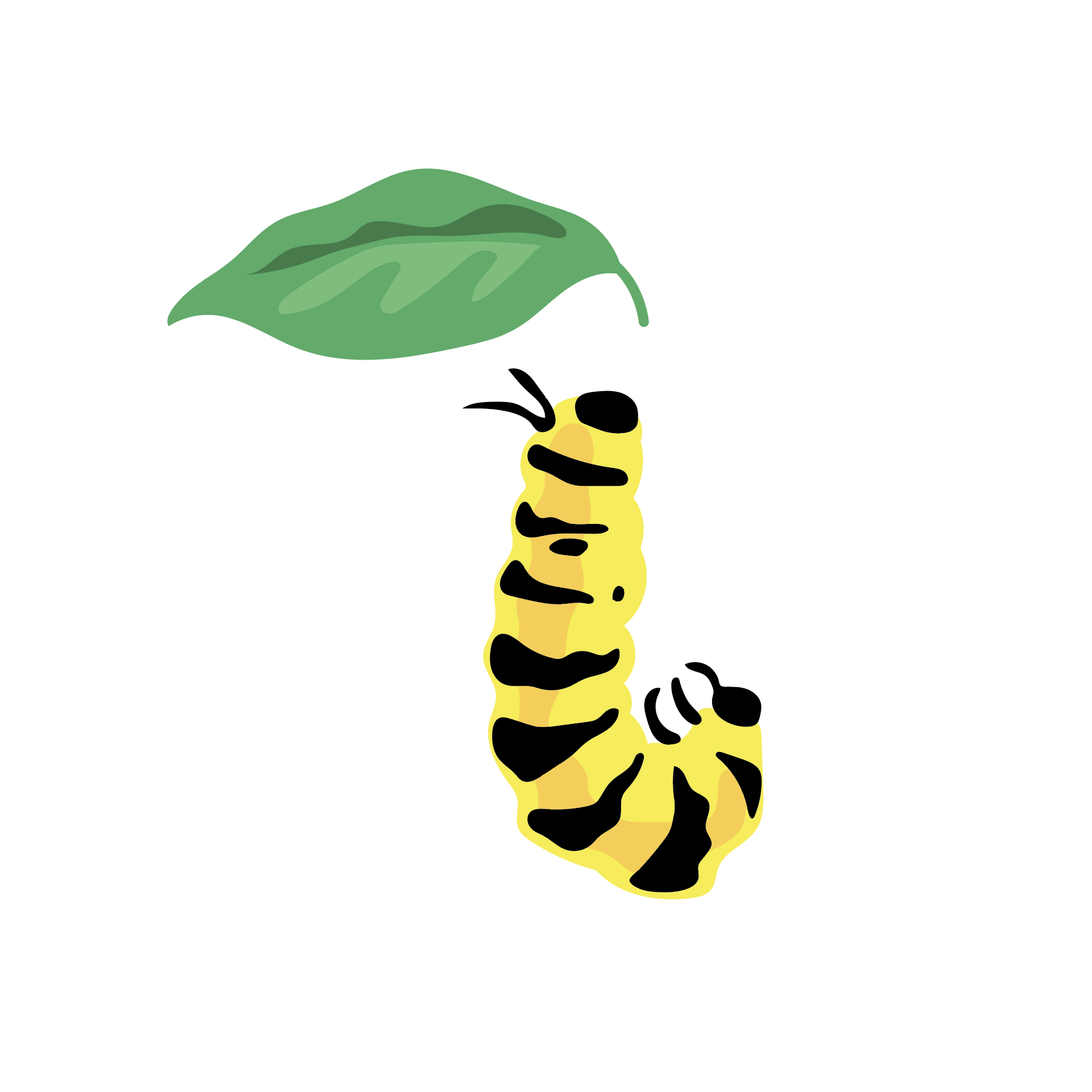
Here are the drawings:
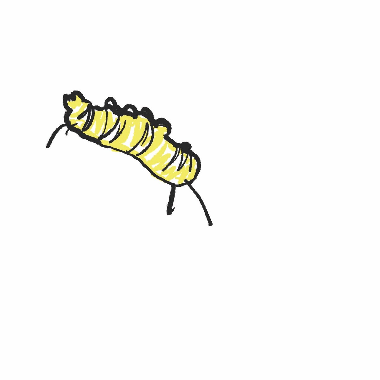
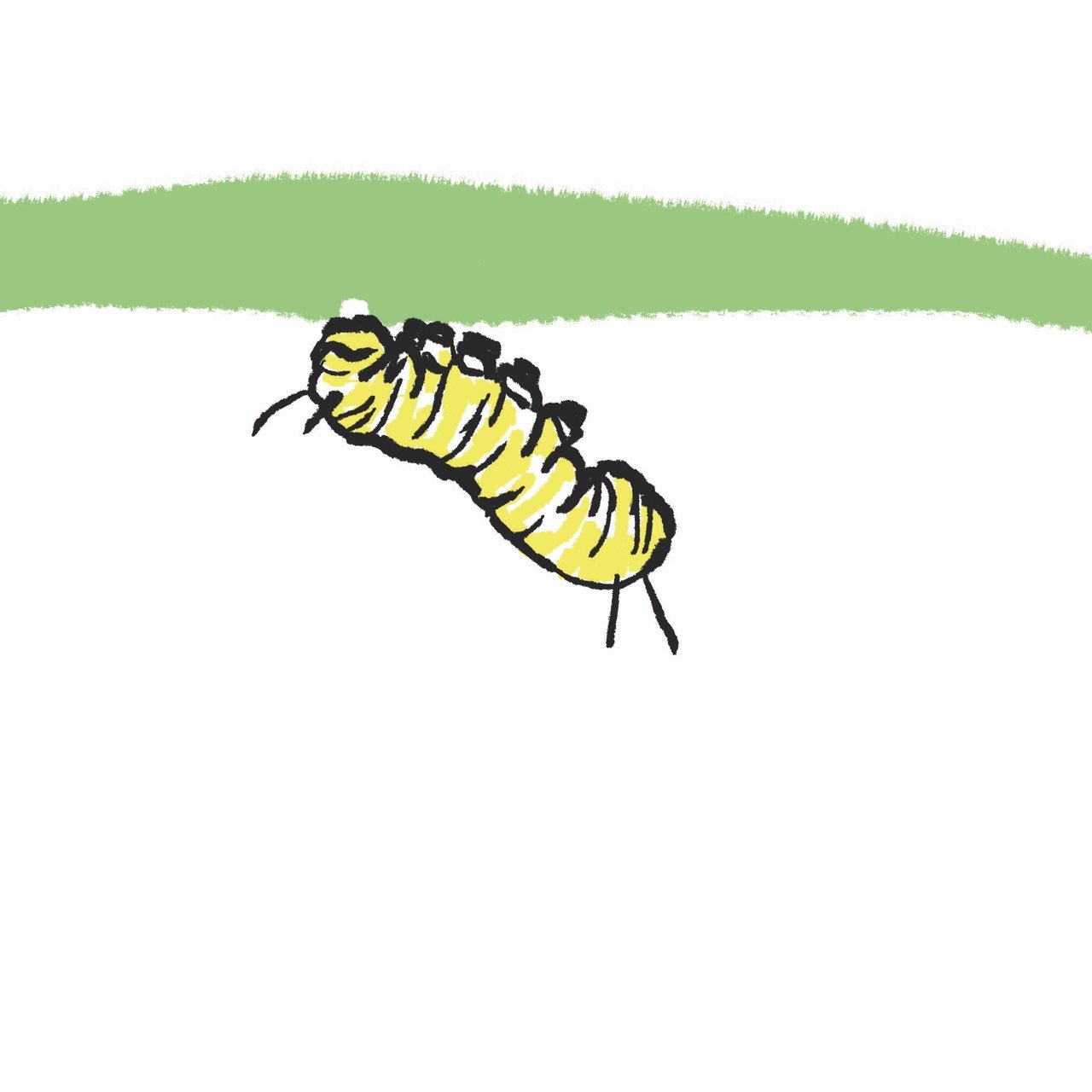
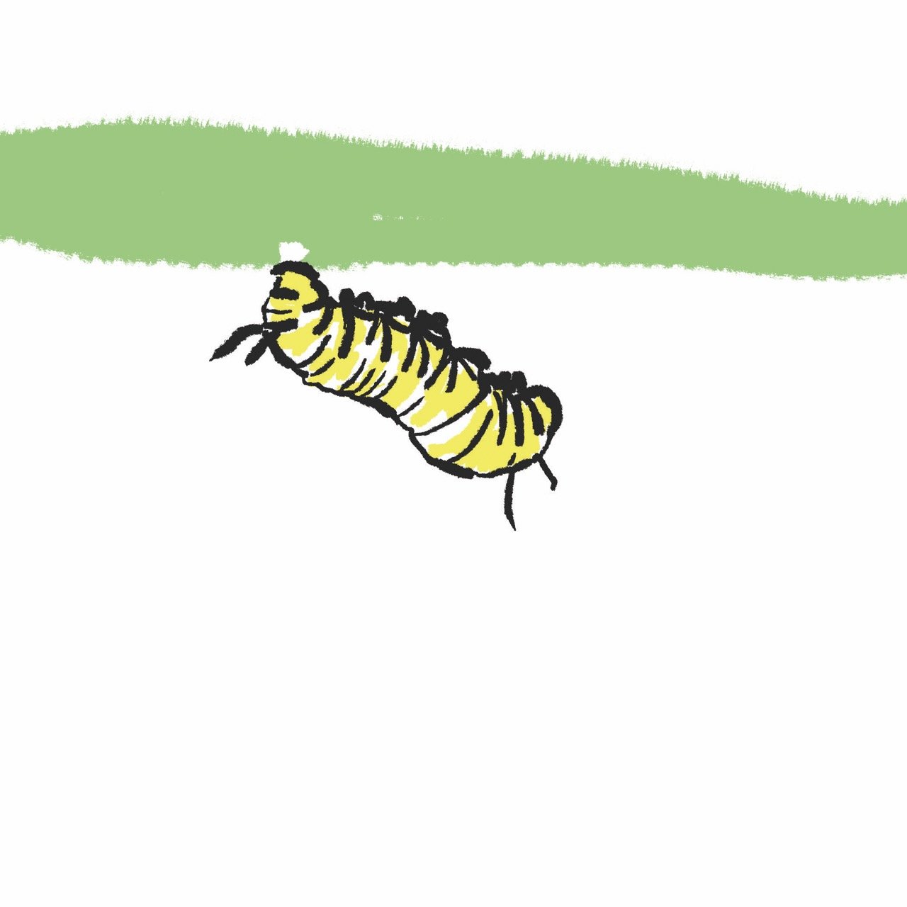
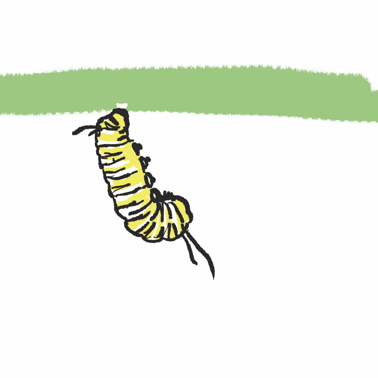
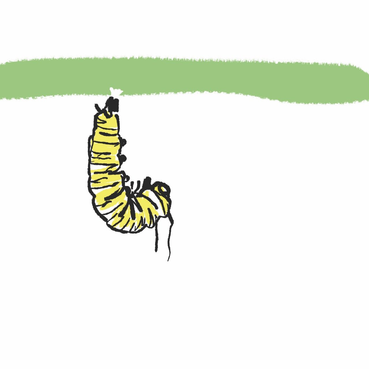
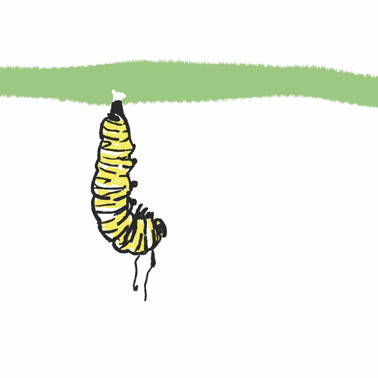
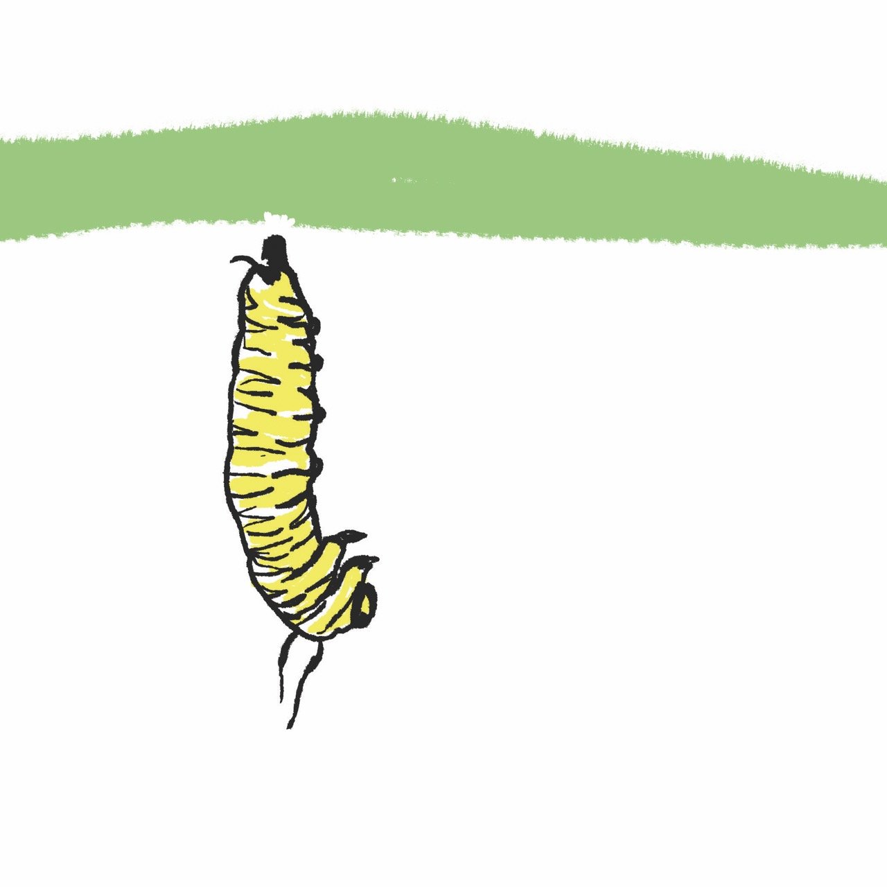
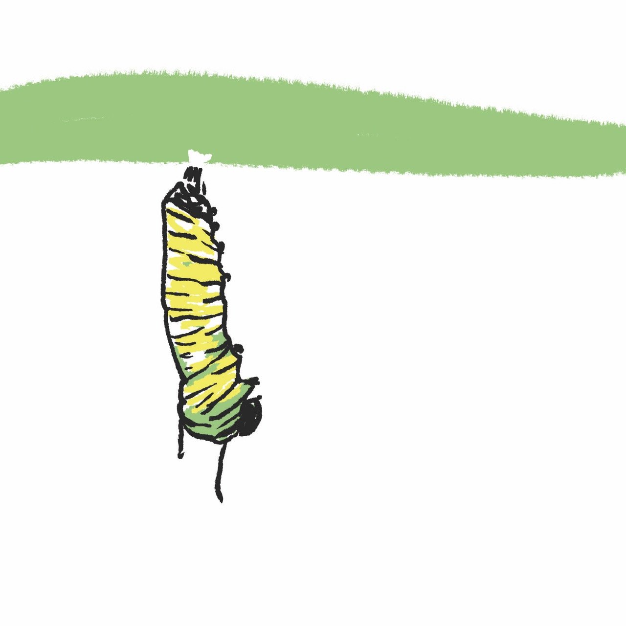
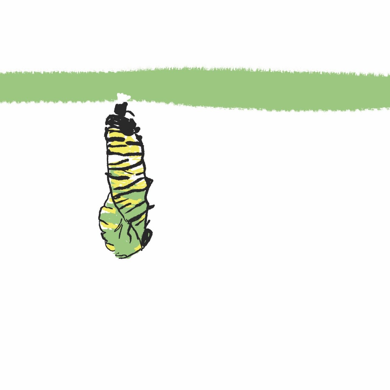
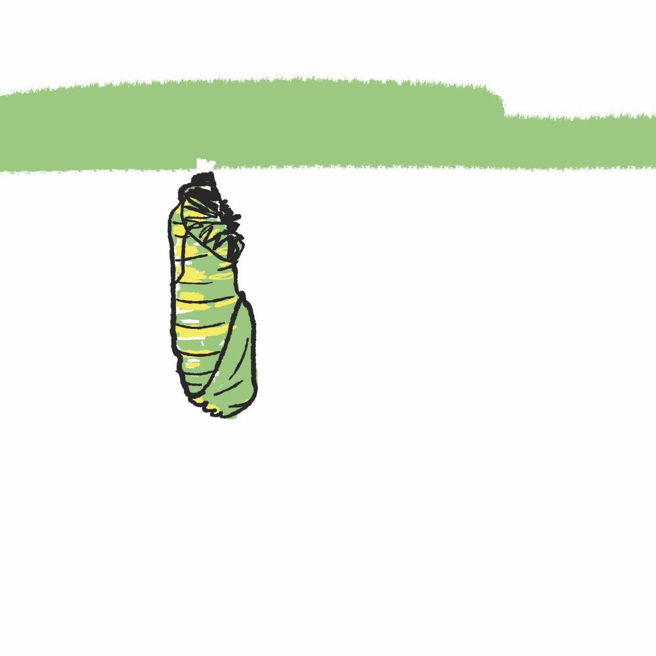
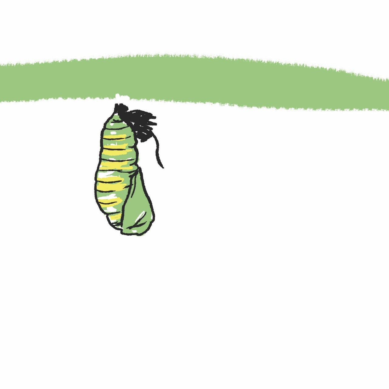
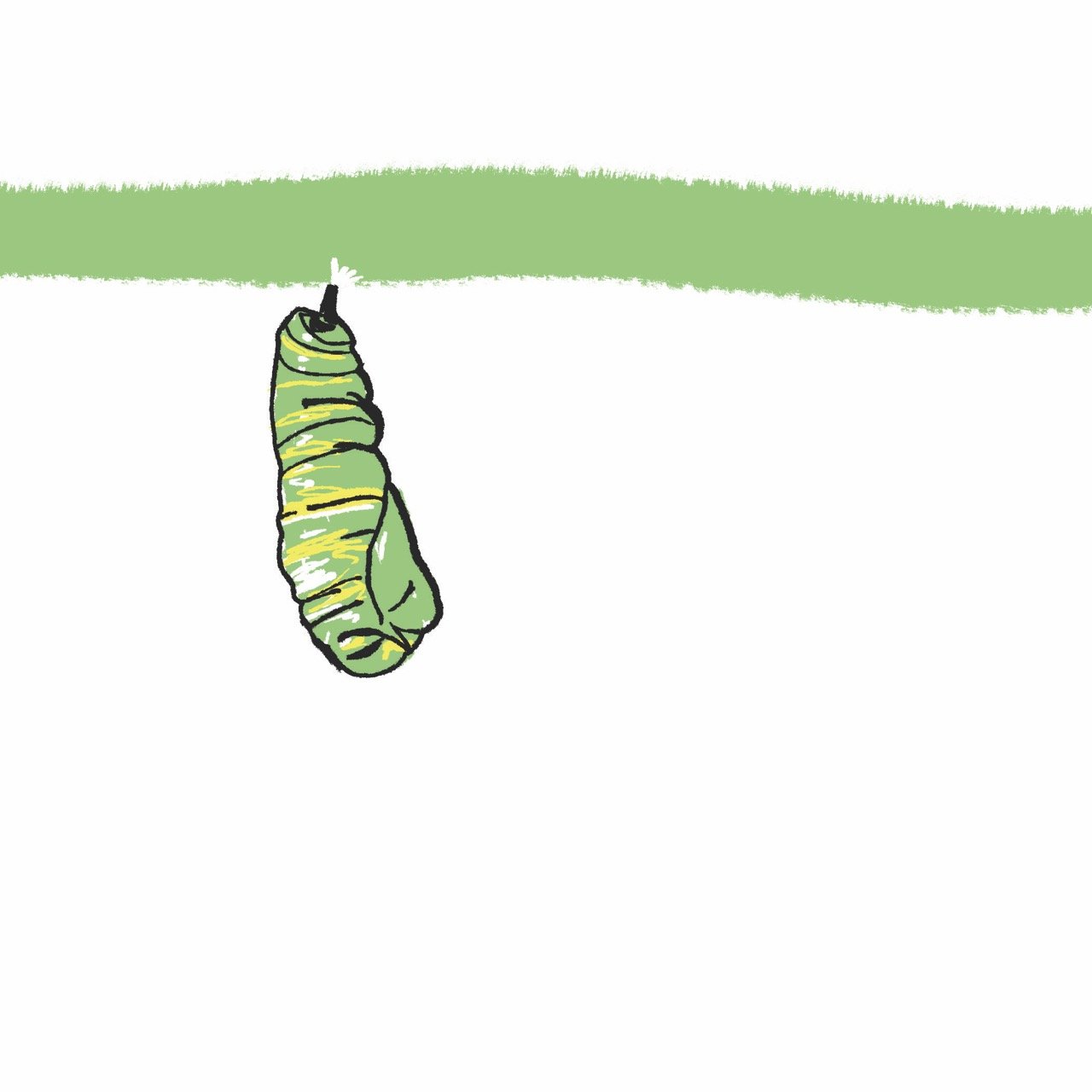
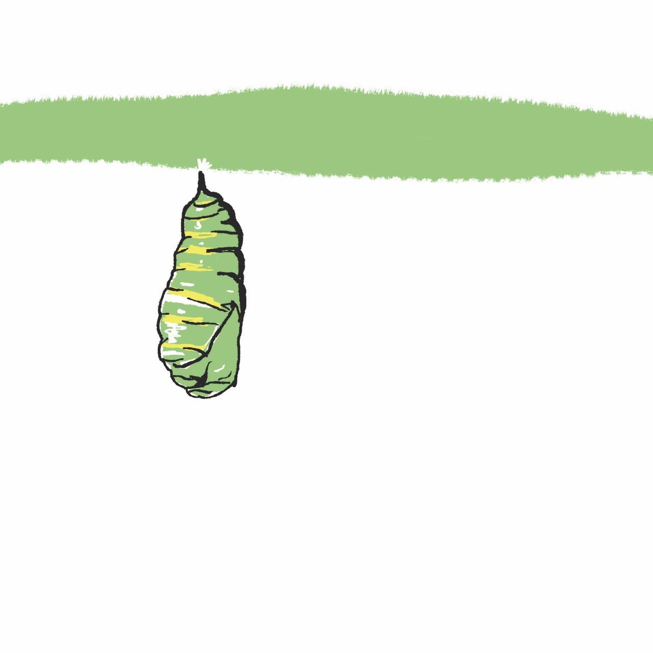
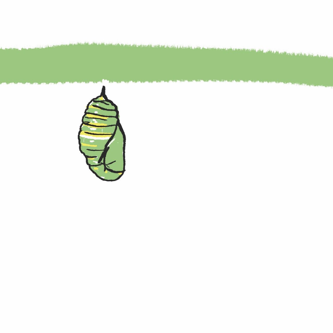
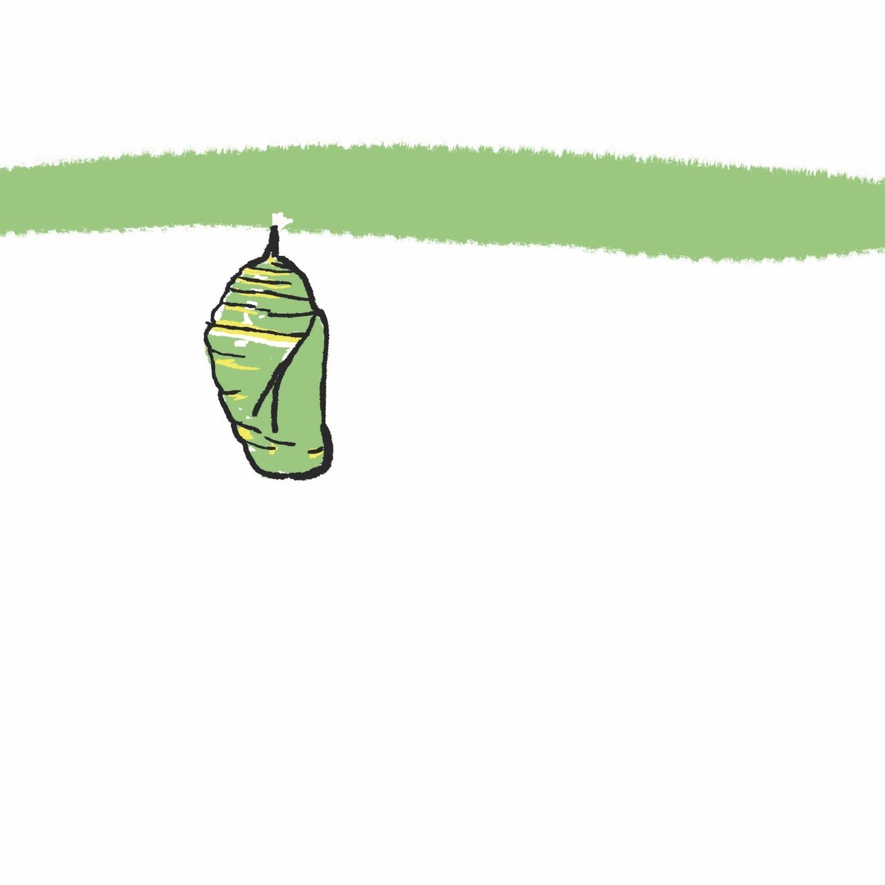
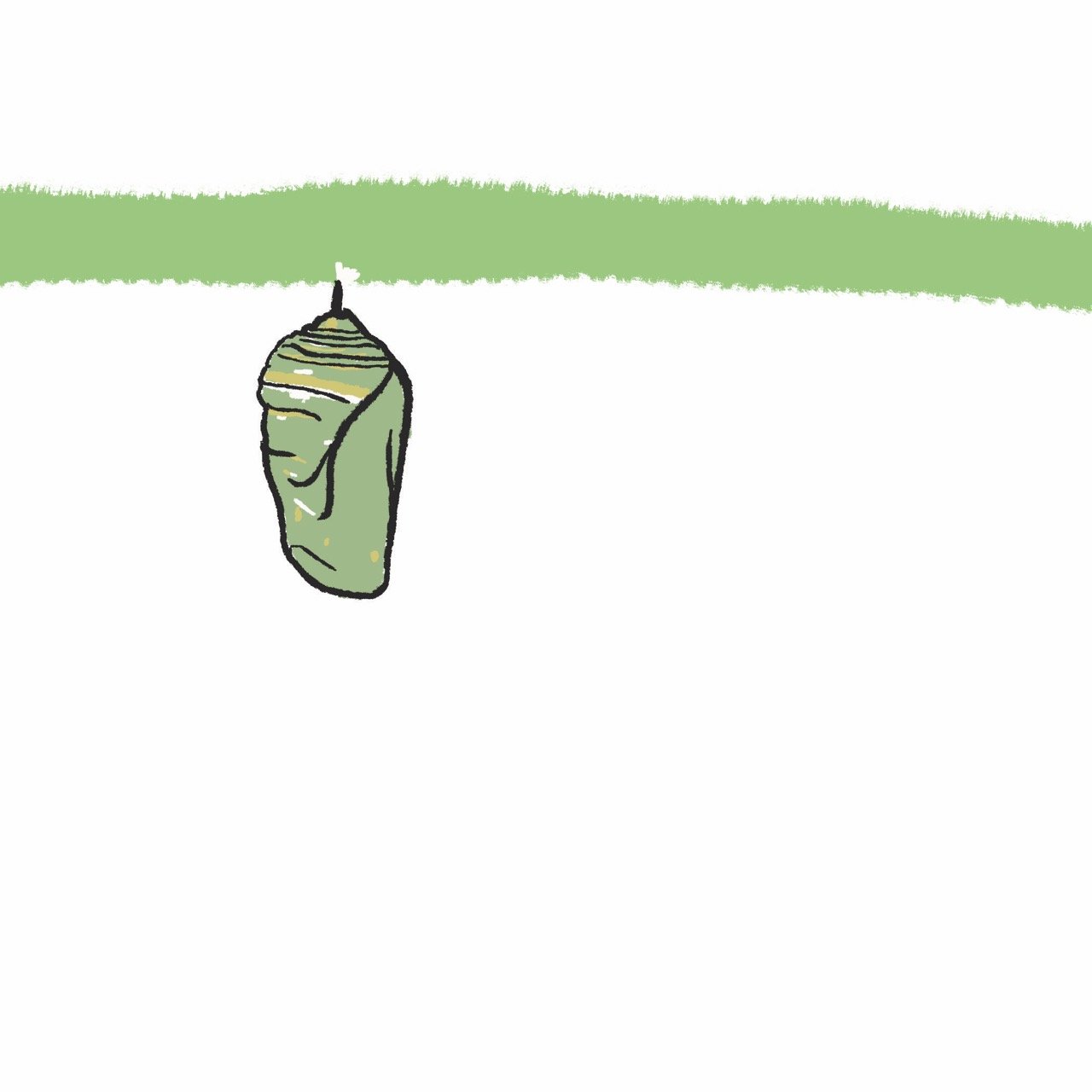
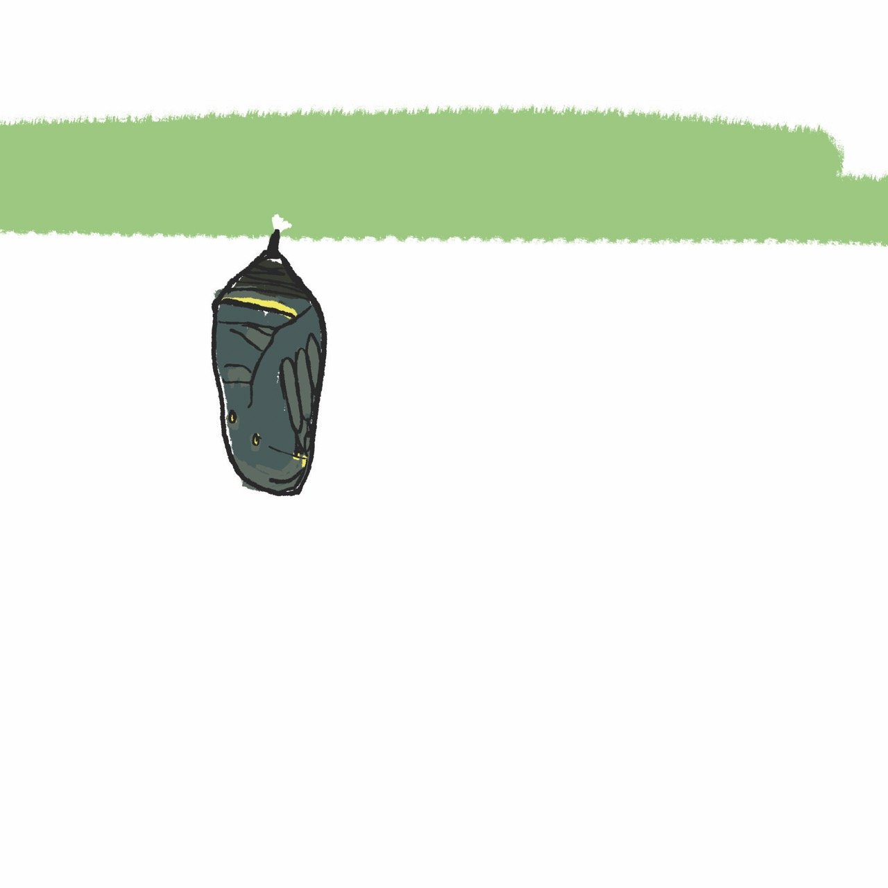
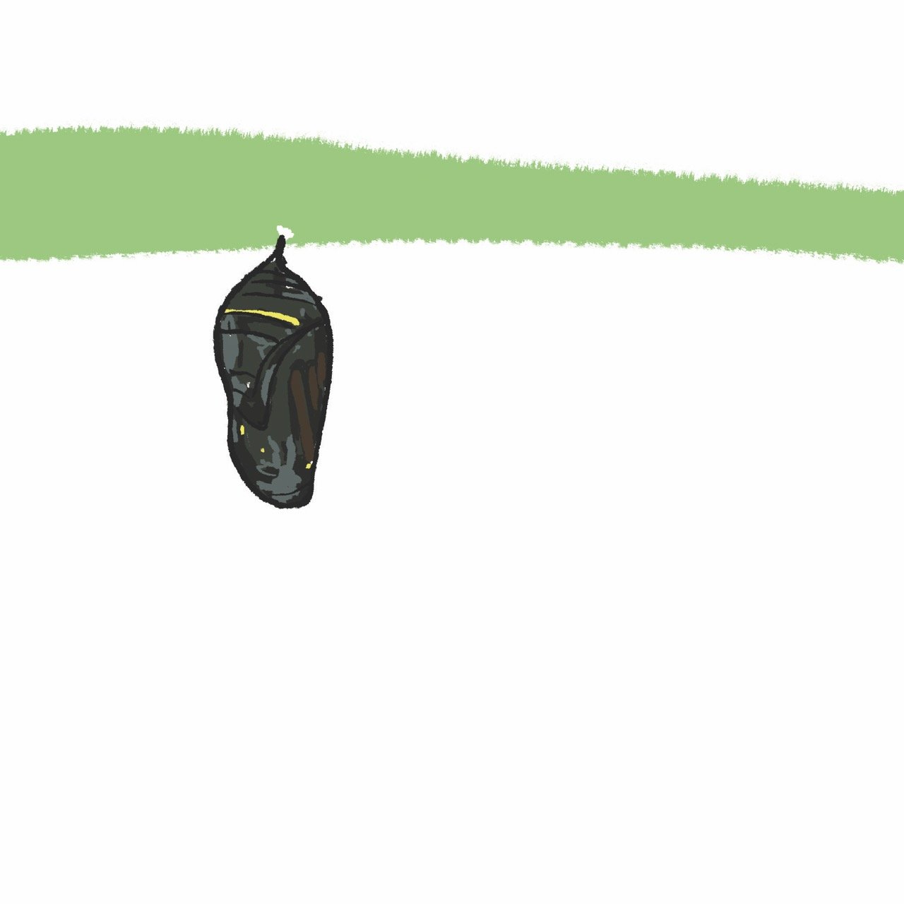
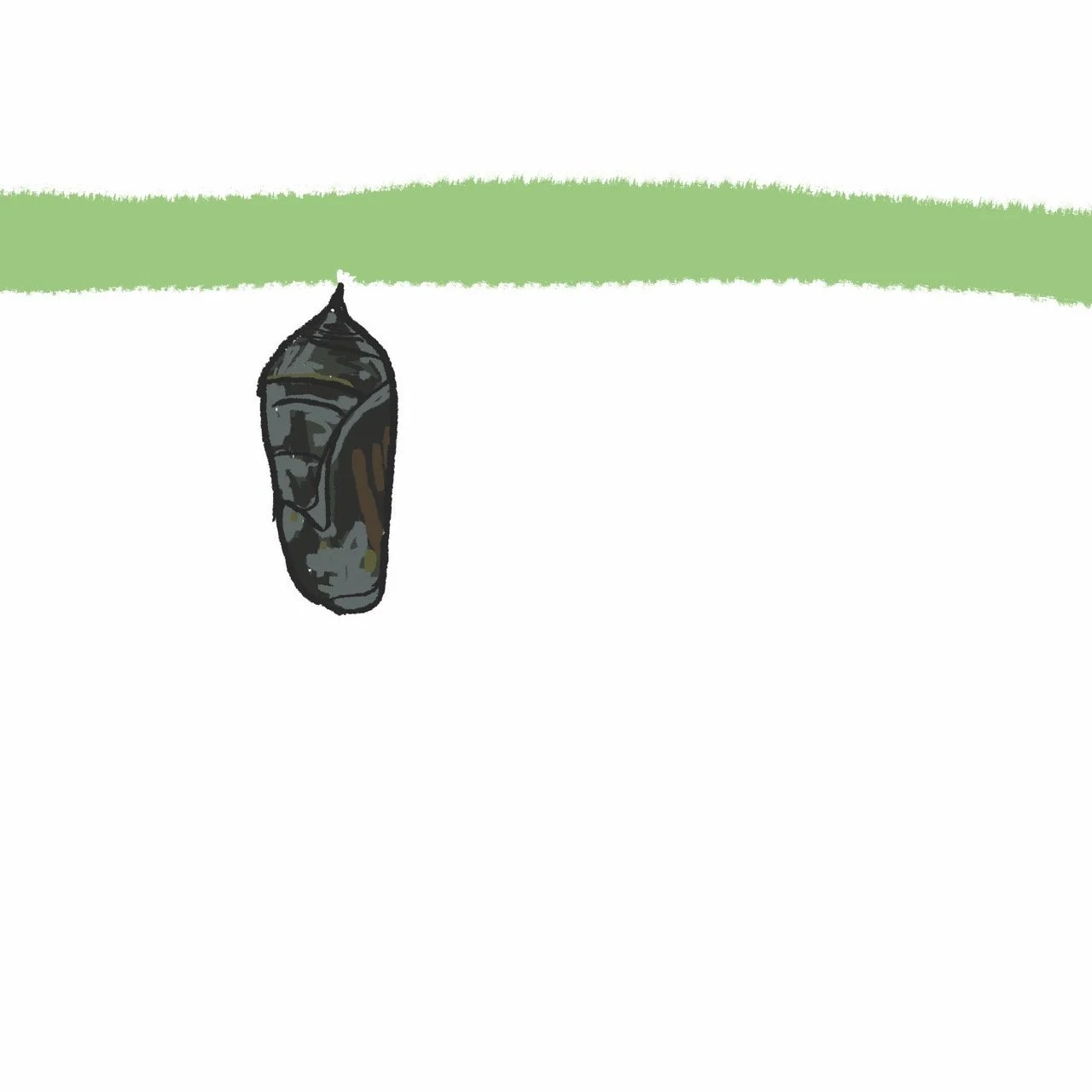
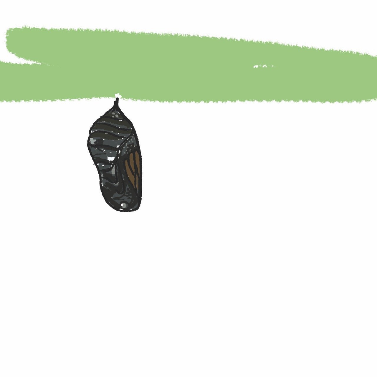
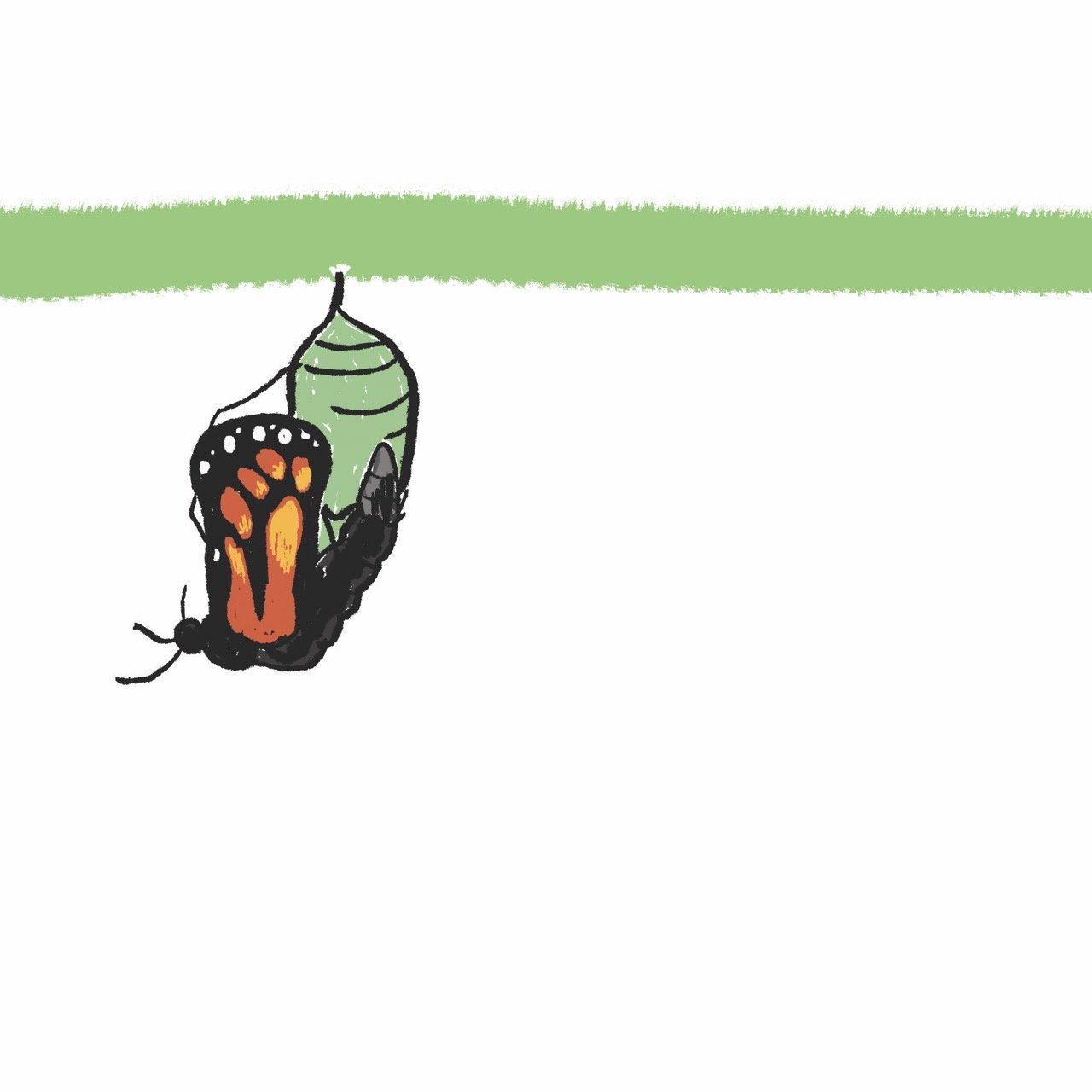
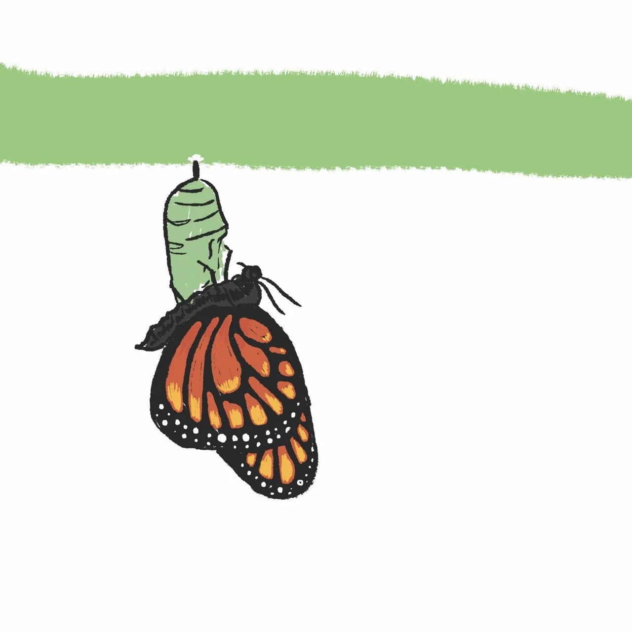
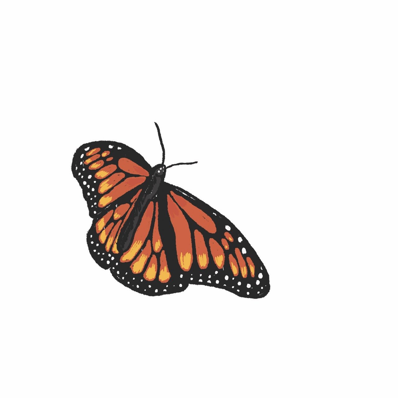
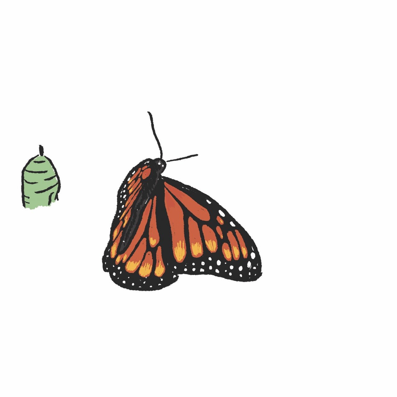
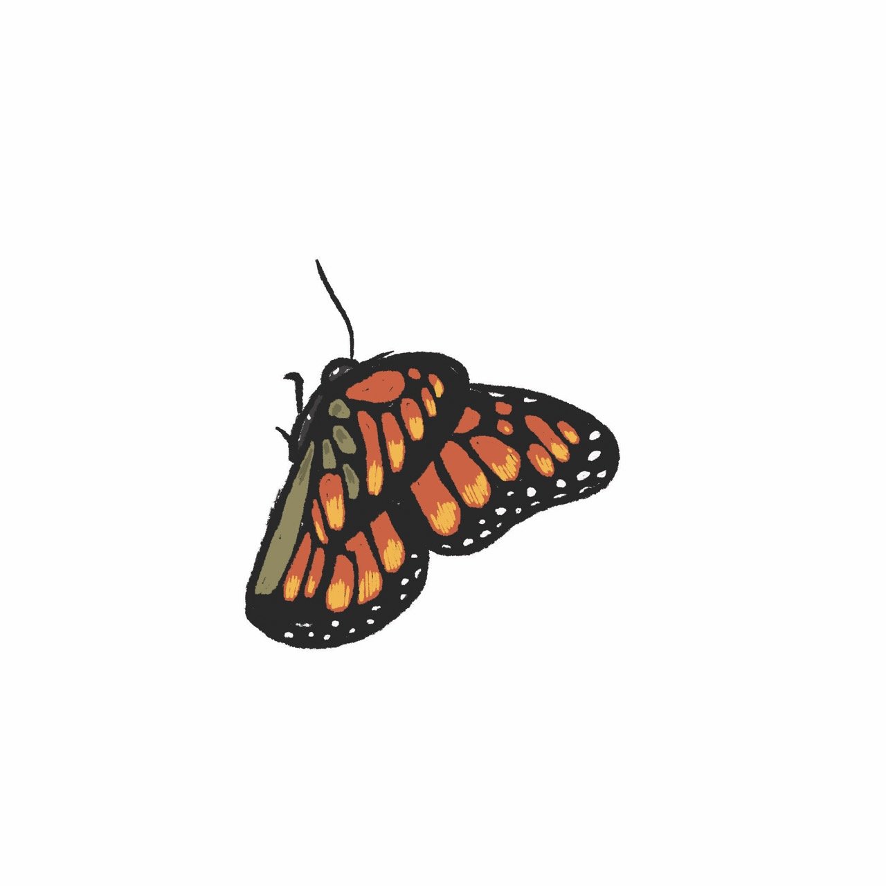
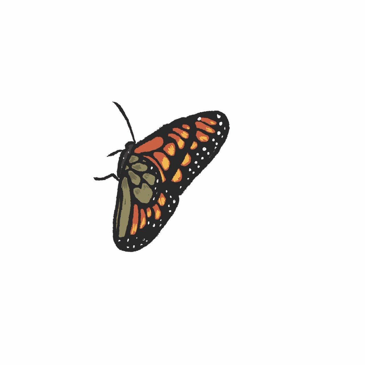
Now that the drawings were complete I picked the frames I wanted for the cover and added a background. I extended that background onto the rest of the frames so it would all feel cohesive when animated.
I also redrew the frame edges and the Isthmus logo so it would all feel drawn, together, in harmony.
This is the final cover.
To create the animation I took a JPG of the cover, zoomed into the first frame and then had all the illustrations I drew come on one after another, creating the illusion of movement.
The end with the butterfly is just the same four frames used over and over again to make it seem like the butterfly is flying away.
Thank you Isthmus staff for letting me doing something a little out of the ordinary! Thank you Tommy for being a great collaborator. The cover would probably just look like that first sketch if it wasn’t for his suggestions and advice. Thank you spring for coming every year and saving us from the perils of winter. And thank you for reading this far.
Go pick up a free copy of Isthmus from your local grocery store, coffee shop or library. You can also see everything on their website here.
They also have a page on their website called “Behind the Cover” that dives a little deeper into the conceptual side of this design. You can read that here.